iPhone-optimized layout in 4 steps
This post will show you how to create a very simple landing page specifically optimized for iPhone. Through this example, we will go over two techniques to display retina-optimized images. One technique is used to load an alternative, higher resolution image for users with an iPhone with retina display. The other technique is to load an alternative, higher resolution background image for a div. You can use these examples to build a full layout for your mobile site.
Note that this post is not about responsive design, nor it uses grid systems. The primary intention is to explore techniques that will give maximum control when designing a layout for our website that is mobile-, and perhaps iPhone-specific.
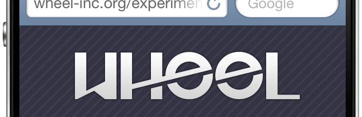
Demo
Click to view a live demo of the code presented below. Remember, this template is optimized for iPhone.
1. Set the viewport
Setting the viewport makes the content scale properly within the available screen real estate. To learn more about the viewport meta tag, check out Apple’s article on configuring the viewport.
<meta name="viewport" content="width=device-width" />2. Using jQuery to load higher resolution images
Here we include the jQuery Retina Display Plugin. This plugin allows us to load images of higher resolution to be displayed in retina-ready screens. In this example, we will use the plugin to load an alternative version of the logo.
Remember to include jQuery itself before including the jQuery retina plugin.
<script charset="utf-8" type="text/javascript" src="http://code.jquery.com/jquery-latest.min.js"></script>
<script charset="utf-8" type="text/javascript" src="jquery.retina.js"></script>
The following Javascript allows us to selectively decide whether to load a higher resolution image or use a standard resolution one. You might want to do this when trying to keep bandwidth use low.
<script type="text/javascript">// <![CDATA[
$&;(document).ready(function() {
$&;('img.retina').retina();
});
// ]]></script>3. The Style
We will only go over a few things that are relevant to the creation of the mobile-friendly layout.
The page_wrapper element encompasses all the elements in our page. Here we set the height to the actual available height in an iPhone in portrait orientation mode. Look at the post mentioned in step one above to review screen pixel availability. We also load an image to overlay on our background (to give it some texture) and give it a relative position so we can later center our logo vertically. For details on this technique, see method 1 in this article.
#page_wrapper {
height: 356px;
background-image: url(stripe.png);
position: relative;
}
Here we use an inline media query to load an alternative image for our background. In this case, -webkit-min-device-pixel-ratio: 2 means that our device has a retina display. Then we load the alternative image and set the image size to half the size of the actual image. For some reason, not resizing the image to 50% (but in pixels, not in percentage) makes our image display in double its size. I recommend you experiment with the background-size value depending on the size of your image.
@media only screen and (-webkit-min-device-pixel-ratio: 2) {
#page_wrapper {
background: url(stripe-2x.png);
background-size: 10px;
}
}
Here we define the attributes of the div that will contain the logo. The position, top, left and margin attributes are part of the vertical centring technique mentioned in step #3 above.
#logo {
width: 225px;
position: absolute;
top: 50%;
left: 50%;
margin-left: -112px;
margin-top: -51px;
text-align: center;
}
4. The Body
Lastly, we look at the contents of the body of our document. The page_wrapper div contains the div that contains the logo and some text.
<div id="page_wrapper">
<div id="logo"><img class="retina" alt="logo" src="logo.png" width="225" /></div>
</div>
Mobile Site
All together now
“http://www.w3.org/TR/xhtml1/DTD/xhtml1-transitional.dtd”>
<meta http-equiv="Content-Type" content="text/html;charset=utf-8" />
<meta name="viewport" content="width=device-width, initial-scale=1, maximum-scale=1" />
<script type="text/javascript">// <![CDATA[
$&;(document).ready(function() {
$&;('img.retina').retina();
});
// ]]></script>
<style type="text/css"><!--
body {
margin: 0;
padding: 0;
font-family: helvetica, arial;
background-color: #334;
font-weight: bold;
color: #dedede;
text-shadow: 0 -1px #000;
}
#page_wrapper {
height: 356px;
background-image: url(stripe.png);
position: relative;
}
@media only screen and (-webkit-min-device-pixel-ratio: 2) {
#page_wrapper {
background: url(stripe-2x.png);
background-size: 10px;
}
}
#logo {
width: 225px;
position: absolute;
top: 50%;
left: 50%;
margin-left: -112px;
margin-top: -51px;
text-align: center;
}
--></style>
<div id="page_wrapper">
<div id="logo"><img class="retina" alt="logo" src="logo.png" width="225" />Mobile Site
</div>
</div>